Update 13 March, 2017: FSDL has been modified with the release of Frogans Player for developers alpha (v1.4.1), in particular with modifications to the values of the “visible” attribute in the <layer> element. The contents of this post and the downloadable resources have been updated accordingly.
Intro
I hope to feature different Frogans site designs on this blog. Some will be my own designs, but I’ll also be happy to share those created by other people (like YOU, for instance!).
Today’s Featured Frogans site is a demo inspired by Le Chariot Paris – Food Truck, a new, high-end Parisian food truck that specializes in gourmet-quality hamburgers. The contents of this site are shown here with the Le Chariot’s kind permission.
The “Home slide”
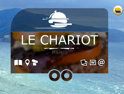
When you go to a Frogans site (always by means of its Frogans address) it opens on its home slide. The design of this home slide mimics the look of Le Chariot itself, which is a trailer.
Note that the top of the slide is semi-transparent, allowing the on-screen elements beneath the site to show through.
Ideally, the home slide will communicate the scope of the content that the user will find within the site. Because of the restricted size of a Frogans slide, you’ll want to get the most out of the space that you use. Plus, it can be nice to have some unused space, so that your slide doesn’t look too busy. One way to do this is to use small icons for your buttons and to reserve an area on your slide for adding a description of the button link when the button is in selected (rollover).
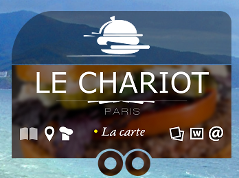
For example, when you pass your mouse over the first icon on the left, a line of text shows up in a reserved area in the middle of the slide, telling you that it is a link to the food truck’s menu (“La carte” in French).
It’s pretty easy to get this effect in FSDL. Each button is made up of two or more layers that are either visible or not, depending on whether or not the button is selected (for instance, whether or not the mouse is over the button). So, even if the layer for basic icon for the button is in one place, you can add an other layer elsewhere that shows up when the button is selected. So, you might have something like this:
<button …>
<layer with icon, visible only when button is not selected (mouse away) />
<layer with icon, visible only when button is selected (mouse over) />
<layer with descriptive text, visible only when button is selected (mouse over) />
</button>
As this Frogans site is a demo, it contains just two other slides. Let’s take a look…
La carte
The thing that we call a “menu” in English is a “carte” in French – as in “à la carte,” where you order one item at a time. What the French call a “menu” is a selection of things that go together, like an appetizer, plus a main dish, plus a dessert. I hope that clears the air.
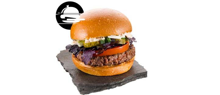
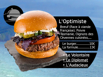
So, that’s why the “La carte” button takes you to a menu item, which is for the purpose of the demo, a sumptuous hamburger, called “L’Optimiste.”
The navigation for this slide is very simple. There are only four buttons: three going to other menu items (“Le Volontaire,” “Le Diplomat” and “L’Audacieux”) on the lower right, and one going back to the home slide on the upper left (in the form of the logo).
With Web sites, we’re used to seeing full navigation menus on every page. If we do the same with Frogans sites, we might not be left with much room for content. The purpose of this slide is to show what a great hamburger L’Optimiste is, so the photo is given priority. A return to the home slide should give the user a full set of navigation options. Optionally, the abridged text of the ingredients could be clickable also, perhaps leading to a Web page.
Note that it is very important to always have a button that can take the user backward in the navigation. This is because, unlike with Web browsers, there is no global “back” button in the Frogans Player user interface. Rather, the author is in full control of the navigation.
La place
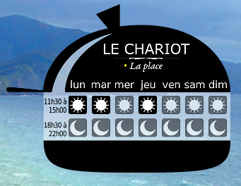
This slide shows where Le Chariot will be located, at lunchtime and at dinnertime, each day of the week. Each button, which either looks like a sun or like a moon, floats on a semi-transparent background. I didn’t want for the background here to be fully transparent because you can never tell what desktop objects might appear underneath the slide.
The navigation is similar to that of the home slide: When a button is selected (rollover), the button changes color (to yellow) but also a descriptive text appears in a reserved area on the slide – in this case, a physical address at the bottom.
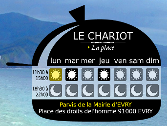
Clicking on one of these buttons could take the user to an other slide showing, for example, the location on a map.
PS: Be sure to check out the “vignette” representations of each slide when you view them at their smaller sizes.
The files
If you want to view this Frogans site in the Frogans Player for developers alpha, you can download the three slides and their resources here. Be sure to use the Frogans Player alpha version 0.2.6 or later.
Your turn
If you’ve created a Frogans slide or site that you would like to have shown on this blog, drop me an email: contact (at) frogans-lab (dot) com.

Leave a Reply